Dissecting My Most Successful Tweet: Aspirational Content Works 🔬 - Issue #25
Hey y'all 👋
Today I'll try something new: analyzing something that has surprisingly worked out 👇
Inching Closer to the Finishing Line ✍️
After a summer break I'm back at it: writing the email-based course.
All-day. Every day.
I'm approaching 5.000 written and edited words.
10.000 - 15.000 more to go.
Creator Log, 9/1/21
— Art Lapinsch 🔋 🌳 🛡 (@artlapinsch) September 1, 2021
After competing in the 'World Series of Procrastination', it's time to roll up the sleeves 💪
Word by word the email-based course is taking shape.
thx @hammer_mt @BigWillieStein @CoreyWilksPsyD @daeliro @wikichen and many others for your support 🙏 pic.twitter.com/aUMVisI0D8
If there's one thing I learned with my previous course launch then it's this: Content is not the problem. Distribution is.
"If you make it they will come" just isn't true anymore.
We have an oversupply of information and value. It's difficult to reach audiences and make them stop and go: "oh wow, I will actually read this."
A couple of months ago I tested and confirmed that posting frequency on Twitter and LinkedIn actually boosts your visibility in everyone else's feed.
That's a good start.
But it ain't enough.
I don't want to spam audiences, hence I looked into my Twitter analytics and found a tweet that performed better than all the others.
Let's dive into it 👇
Analyzing My Most Successful Tweet: The Data
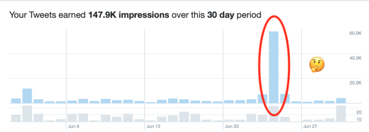
First, let's look at the data for the month of June 2021.

Roughly 150.000 impressions for the entire month of June.
More than a third coming from a single tweet 👀

Reading through the numbers I take the following takeaways:
- Detail Expands: The visual was interesting enough that 701 people clicked into the image to magnify
- Retweets: The content was valuable enough that 15 people
To me, it indicates one thing: value to the audience
...
Here is the tweet 👇
This is my current tech stack for my one-person e-learning + consulting company👇
— Art Lapinsch 🔋 🌳 🛡 (@artlapinsch) June 23, 2021
Curious what y'all are using 🤔 pic.twitter.com/evT3rWeD0R
Dissecting My Most Successful Tweet: Why It Works
I would love to replicate these types of tweets more frequently. It's a win-win.
- I get more eyeballs on content (i.e. fill my top-of-funnel for the course)
- Readers get something remarkable (as per Seth Godin's idea of ' how to be remarkable')
"Remarkable doesn’t mean remarkable to you. It means remarkable to me. Am I going to make a remark about it? If not, then you’re average, and average is for losers."
Time to get tactical.
These are the reasons why I think the tweet worked (+ attached are retweets or comments on the original tweet):
#1: Visual = Easy to Digest
Adding an image, infographic, gif to the mix just works much faster.
Humans process visual information extremely fast.
Twitter is a fast medium, where you need to grab attention quickly.
My screenshot of a notion database has colors and is neatly formatted.
Who else finds nicely organized info yummy 😋 https://t.co/sqFLQHDNMD
— Yina Huang (@yinahuang) June 23, 2021
#2 Value = Packs a Lot of Information
The content packs a lot of value in one image:
- Tool: Which tools am I using
- How: What's the application
- Price: How much does it cost
More importantly, to someone who is in a similar position (i.e. solo founder) this can be a shortcut to understanding how to compose their own tool stack.
Great list for one person companies https://t.co/B142J1siT1
— Stocktwits Lindzon (@howardlindzon) June 24, 2021
Question = Prompting Interaction
The addition of Curious what y'all are using 🤔 invites readers to chime in and share their own knowledge.
A lot of the same! But also @webflow for my website and @lucidcircus for engineering/design. @Vimeo for video storage.
— David Grew 🛠🏥 (@DoctorGrew) June 23, 2021
More interaction on the tweet leads to more amplification of the content -->leads to more eyeballs on the content.
Teachable for online courses
— Haider Al-Mosawi 🚢 (@haideralmosawi) June 23, 2021
ConvertKit for email
Camo to use my iPhone 12 as my web cam
TaskPaper is my current HQ
Canva/Figma for graphics
I probably have a few more tools I use & a few I’m looking to explore.
I’m curious to know the benefits of Your Company in Estonia. 😬
Insight = Look Behind the Scenes
Ok, this one is a far stretch but I'll share my hypothesis:
People are drawn to aspirational content
It is fun to peek behind the curtains at something that is not in one's ballpark.
I remember how in 2004 and 2008 I was glued to the TV screen watching all sorts of documentaries and segments of 100m sprinters preparing for the Olympic Games.
- What they eat.
- How they train.
- How they feel.
Meanwhile, I probably had a bag of chips on my lap and was enjoying the shit out of the experience.
I was living their lives vicariously.
I'm not an Olympic athlete.
I'm just a dude who doesn't have a 9-10-5 job and is trying to make the new gig work.
To some, this might be aspirational.
Epilogue: What Do You Think?
Obviously, the analysis is conducted on a sample of one (n=1).
I don't think it is the ultimate truth but it was fun to try and break down some previous content.
I would love to hear your thoughts.
Does that make sense?
...
Stay happy, stay healthy 🙌
Art
